
Proposal:Edward Jones - Edwardjones.com Financial Advisor Locator Prototype


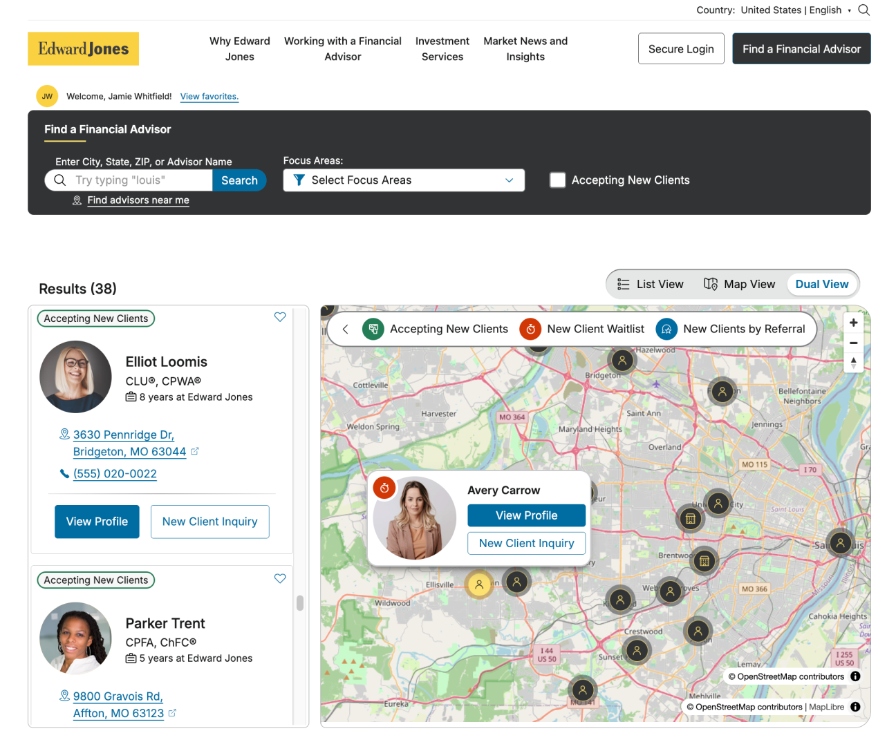
Expected Benefits Include:
Experience the Prototype
View the full page prototype or via the embedded window below.
The Opportunity Space
Edward Jones' main digital marketing surface, edwardjones.com, has long played host to its primary client acquisition mechanism, the Find a Financial Advisor experience. During and following the site's 2020 redesign and replatform, rushed implementation, technical limitations, and years of design drift combined had led to an experience plagued with user flow, usability, and performance issues.
Years of quantitative and qualitative user interviews, heatmap analysis and other research pointed to a clear set of UX problems that all contributed to a clunky and dated experience that failed to meet modern users' expectations:
- Separate mechanisms for geographic and advisor name searches
- Full page reloads between list and map search results views
- No clear method for navigating between results and individual profile pages to compare different advisors
- No way to tell if a given advisor was open to accepting new clients, leading to users' time wasted on submitting contact forms that often received no response
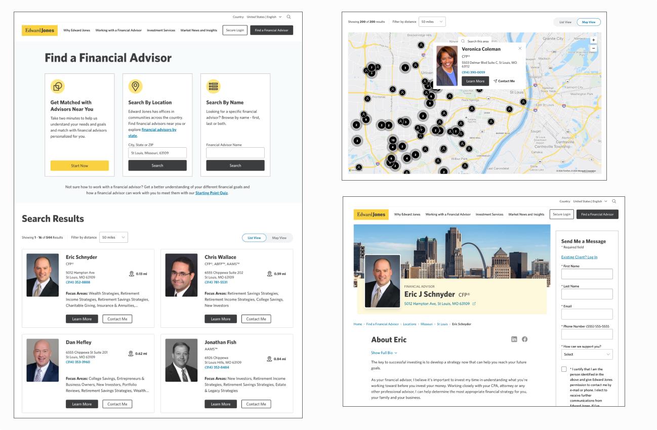
When the firm launched a major new initiative to significantly augment it's traditional one-advisor-one-location branch office model with new multi-advisor locations, I took the opportunity to re-imagine and modernize the design of the locator experience and with it, propose a unified Financial Advisor/Branch Entity component suite that would synthesize disparate elements of design language that had evolved around advisor presentation in different product portfolios.
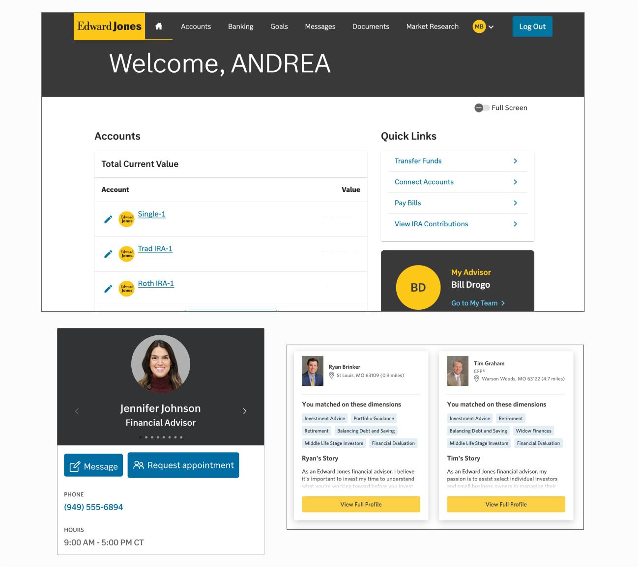
This effort would afford an ideal platform for driving full adoption of the firm's enterprise design system, AXIOM, along with newly published design tokens and an expanded color pallette in a scoped experience, and create ties to a work-in-progress prospect authenticated platform, where prospective clients could bookmark advisors, complete assessments like the Starting Point quiz, and collect documents in preparation for converting to a client. The locator prototype would also hope to make the case for updating our service model and our branch and advisor entity APIs with a status field to indicate an advisor's openness to new clients.
And finally, this prototype would also present a proof-of-concept for moving edwardjones.com to the headless version of the Acquia Drupal Content Management System (CMS), enabling a decoupled front-end that could directly import the AXIOM React component library.
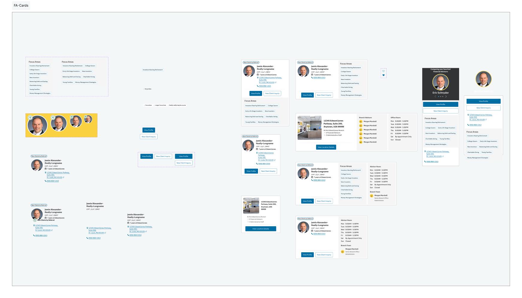
Designing the Advisor Entity Components
Designing the core pillar of the Financial Advisor/Branch Entity, I wanted to compose flexible patterns made of smaller atomic subcomponents that could conditionally present various facets of data for a given entity depending on the surrounding context and across a variety of layout considerations, such as within collections, promotional elements, map tiles, and full screen hero sections.
This would need to consider:
- adaptive sizing based on container constraints.
- the ability to favorite, or bookmark, an advisor when signed in to the authenticated prospect platform.
- rendering optional entity datapoints, such as years of experience, branch address, and professional designations.
- displaying semantic tags communicating an advisor's status as relates to accepting new clients.
Imagining an Optimized Advisor Search Flow
The existing locator experience presented users with three entry points for search: one linking off to the separate Edward Jones Match application and a search field for each of the aforementioned search mechanisms, geographic and advisor name. These visual elements took up the overwhelming majority of "above-the-fold" screen real estate and for a user to adjust their search, they need to scroll back up to this section and start again.
I designed a new advisor search entry that would combine geographic and name searches into a single, federated search and position it as the primary method of locating an advisor. This aimed to reduce cognitive load by addressing feedback from user research and aligning search with user expectations.
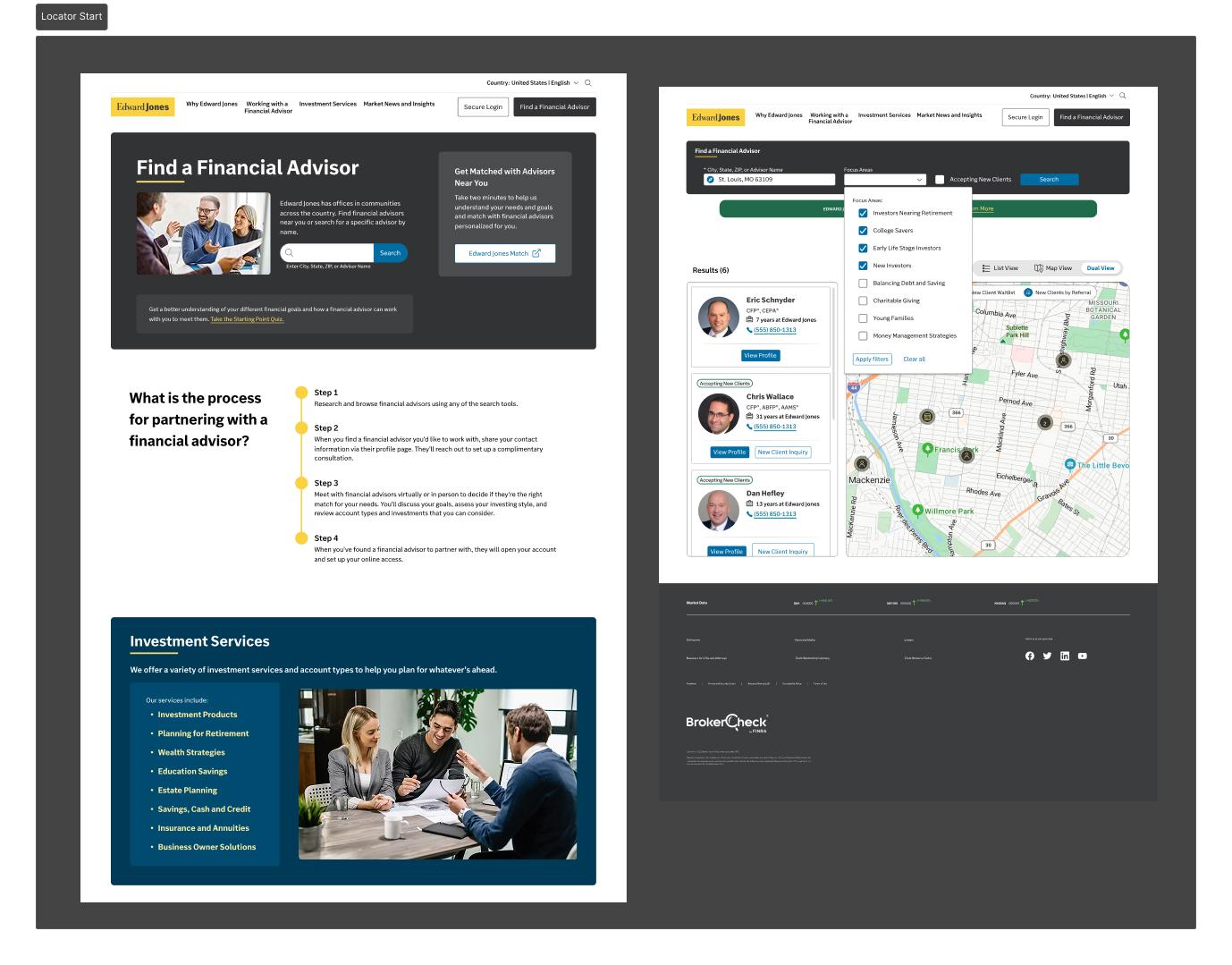
The action to jump to the offsite Edward Jones Match experience would move to a secondary, but still prominent position and be clearly denoted as a new window action, designed to reduce occurances of users unintentionally navigating away from the current session.
Upon intial submission of a search query, the new design would transition to a condensed state anchored to the top of the screen, and offer limited filtering options for search refinement while keeping current search info and results visible in the same viewport.
Adding a Search Results Dual View and a Saved Advisor Comparator
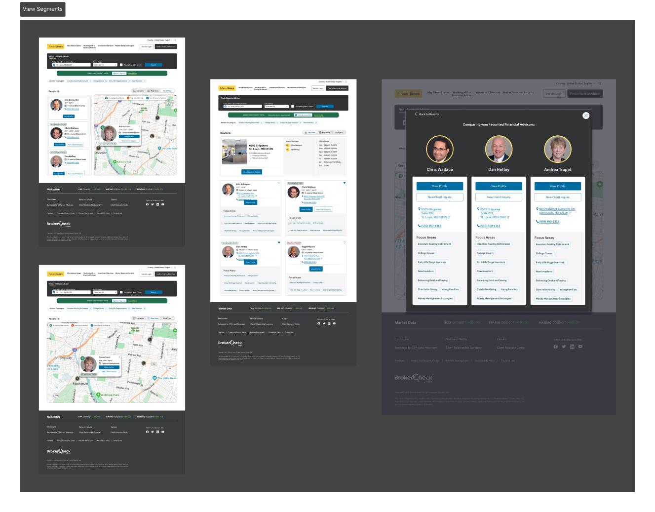
Taking inspiration from analogous store locator experiences in the retail sector, the proposal adds a dual results view combining list and map views side-by-side in a manner that users are familiar with. For users signed in to the prospect platform, list item cards and map tiles would afford the opportunity to add to the user's saved advisors list directly from the results views, instead of having to visit a profile to take that action.
Signed in prospects could also view and compare their favorites at any time to help narrow their choices.
Refreshing Advisor Profile Pages and Adding Location Profiles
The updated Advisor Profile screen would add to and compact the most critical information in the Hero section, allowing users to quickly scan to see an advisor's phone number, address and professional designations, and whether they are currently accepting new clients.
Contact forms that currently appear on every advisor profile would, in this proposal, only render on profiles for advisors that are open to new clients. This aimed to reduce or eliminate instances of prospective clients contacting advisors and not hearing back, which results in a negative experience and tarnished brand.
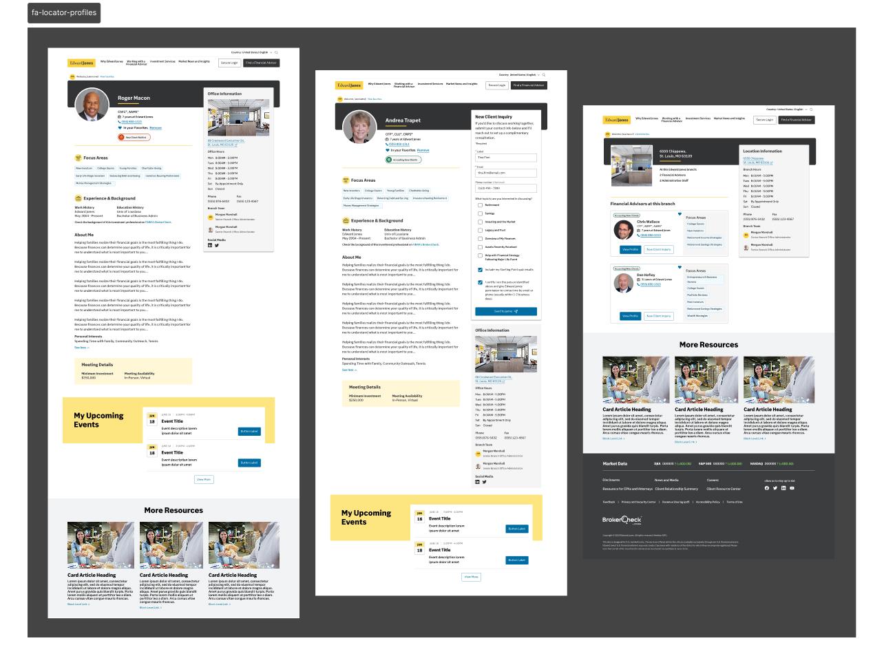
Additional proposed changes include: tying the advisor Focus Area component more closely to the design etablished in the Edward Jones Match application, but updating using the expanded color pallette and adding a dismissable variant to serve as filter facets in results screens; and bringing in the high-contrast hero background with the primary Brand Dark Gray color familiar to clients from the Online Access account access application.
Driving Impact
Expected benefits from these proposed changes include:
- Improved UI consistency across products.
- Decreased page load speeds.
- Significant reduction in time-on-task for users searching and browsing multiple advisors.
- Reduction or elimination of non-responses from advisors following prospect outreach.
- Proof of concept for full adoption of company Design System and published Design Tokens.